This project’s goal was to design a tool that would increase Pharmacy Assistants’ ability to recommend health products to their customers.
Our solution was to design a mobile app that included existing eLearning modules, scenarios and new tools. The app ensures that the Pharmacy Assistants always have the comprehensive resources they need at hand and provides them with the job support they needed. It also increases brand engagement and maintains the pharmaceutical company as a leading innovator in the health industry.
My role included contribution to all aspects of the project, from analysing existing content to designing new interactions and prototyping. I led the transition from a desktop-oriented to a mobile-oriented design for the app.
The process
Research
Research was conducted to understand the needs of learners and the business model. We investigated the way Pharmacy Assistants use the existing platform and its learning content.
We discovered that bite-sized learning, unlike the existing lengthy module approach, would be preferred. They were interested in a tool that is accessible in their pocket so they have access to the information at their fingertips. This led to the decision to design a mobile app.
User Task Analysis & App Flow
Through brainstorming of user task analysis we considered the experience of learning and recommending products to customers. This highlighted opportunities where our app can improve Pharmacy Assistants’ learning and work experience.
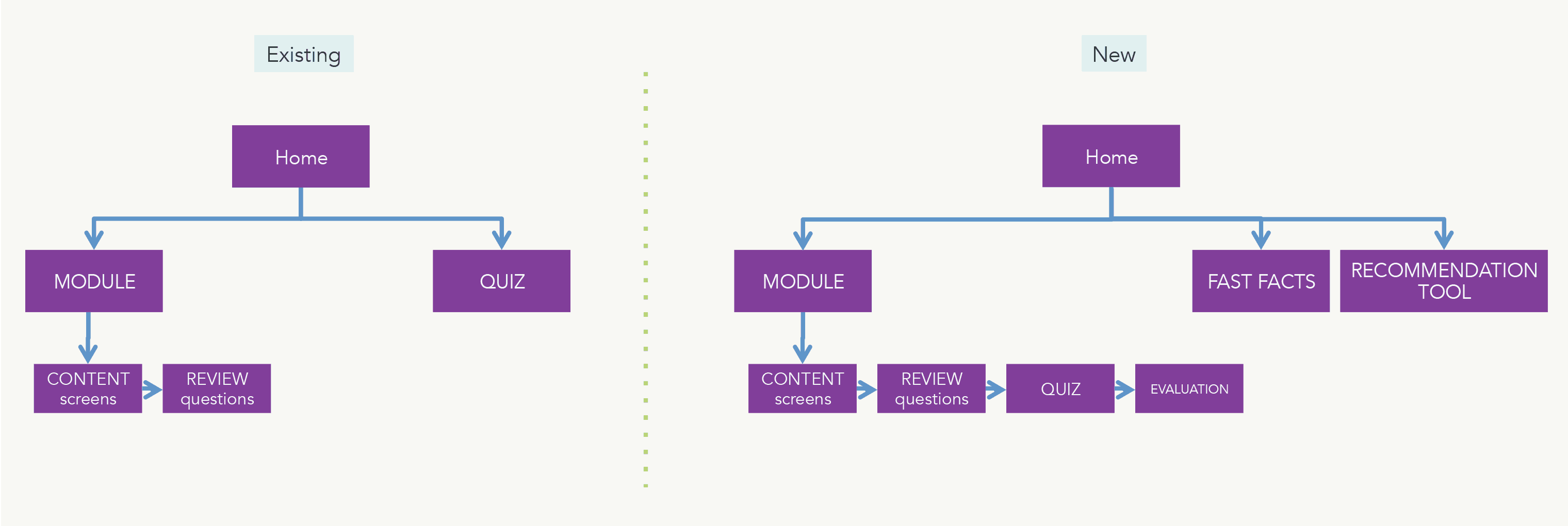
We asked ourselves how will the user journey “flow” on a mobile, and what other features can we add for mobile context. This led to development of the main structure for the app, including three distinct sections:
- eLearning modules – training resources including customer scenarios, quiz and evaluation
- Fast facts – product information
- Recommendation tool – ‘just in time’ interactive tool to assist in diagnosing customer’s needs
Wireframing and Interaction Design
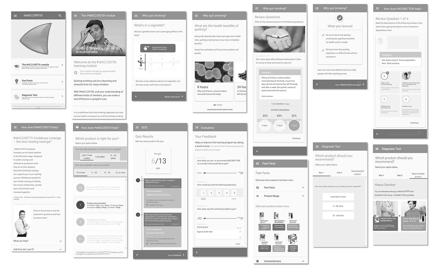
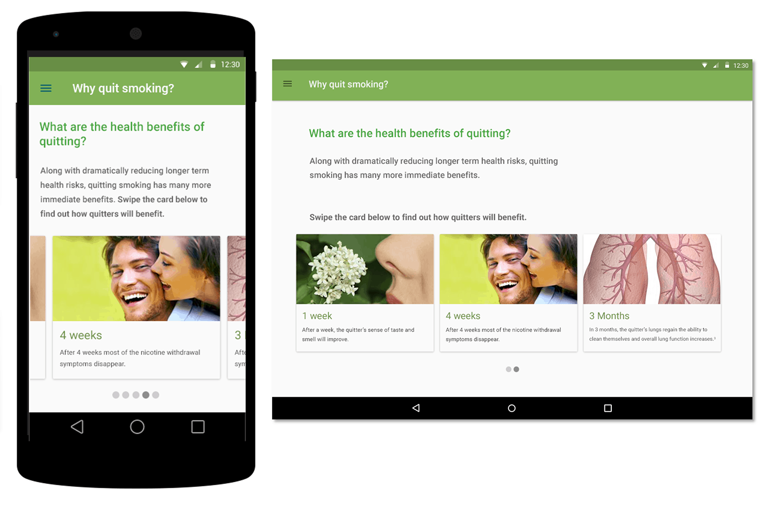
This included an in-depth analysis of the existing learning content. Each screen interaction was redesigned so it would work on various devices. We started from the mobile perspective and worked up to the tablet/desktop perspective.
- Splitting up content into small, manageable sections.
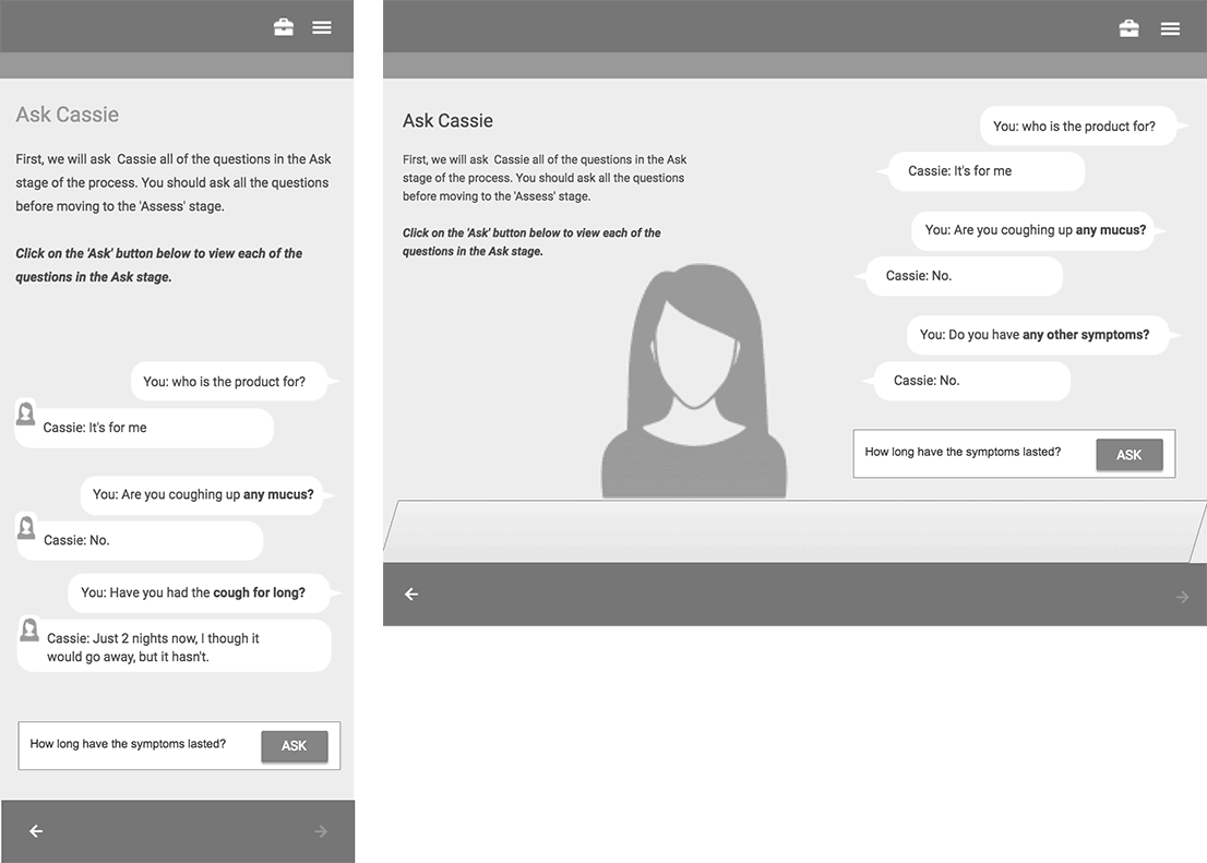
- Enhancing the experience by redesigning meaningful information into an interactive scenario, where the Pharmacy Assistant could interact with a virtual customer and practice and improve their skills.
- Redefining the existing module navigation to include common responsive patterns.
- New interactions were considered to accommodate for touch screens, such as Swipe/Tap instead of click, multiple questions instead of drag and drop.
- Creating a template library to assist designers and clients in future projects.
Look and Feel
UI screens were designed to assist developers in the final build of the app.

UX Methods
- User Task Analysis
- User Flow
- Wireframing
- Interaction Design
- Prototyping
- UI Design